Resampling, Smoothing and Seasonal Patterns
Category > Time Series Preprocessing
Wed 04 May 2022Resampling, Smoothing and Seasonal Patterns
Welcome to the third video of the tutorial for the AI Starter Kit on time-series pre-processing! In the previous video, we already had a look at the temperature values and saw a clear seasonal pattern. For active power and wind speed however, it’s not so easy to answer if particular patterns are present because the data is noisier.
In general, visualizing time-series data with a high temporal granularity might make it difficult to interpret and detect underlying patterns.
Resampling techniques allow to reduce the temporal granularity, thereby revealing longer-term trends and hiding sharp, fast fluctuations in the signal.
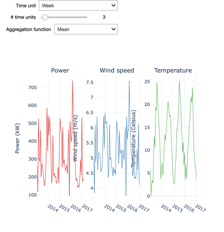
In the interactive starter kit we can select the amount of resampling by specifying the time unit and the number of time units to resample to. For example, we can resample the data to weekly values. For this, we set the time unit to "Week" and the number of time units to 1.
Playing with these two inputs, we see how the level of detail of the time series changes and how that influences the insights that we can derive from it.
In a first step, we select a small resampling factor, for example a daily resampling. We observe that the visualization of the temperature shows a seasonal pattern in the data, even though strong stochastic fluctuations dominate the overall picture. At this level of granularity, the visualization of the wind speed is not at all interpretable due to these fluctuations, especially when visualizing over such a long period of time. Specifically, if we are interested to visualize the long-term trend of the time series, we need to reduce the sampling rate.
To this end, we need to increase the resampling rate to a weekly resampling. We then see how these high frequency patterns disappear and it becomes possible to analyse some long-term fluctuations in the power and wind speed variables. You can notably observe the strict correlation between the patterns of wind speed and active power, which might be obvious: the more wind, the higher the power that can be generated by the turbine. Note also that by increasing the resampling of the time series too much, most of the information it contains is discarded.
It is also important to understand that resampling aggregates the data for the specified period. Hence, we need to specify how we want the data to be aggregated. For the wind speed and temperature data in our example, we can opt to aggregate the data using the median of the values within the selected period. Like this, we level out very high or very low values. Therefore, this statistic is quite robust against outliers that could be present in our dataset. For other quantities, we might consider other statistics. For example, if we were considering power production, the interesting value is the power produced per day or week. Consequently, it makes more sense to sum all the data samples rather than to average them. Does the sum function also make sense for the temperature or wind speed?
Think about it and then try different resamplings by changing the aggregation function or resampling units used.
As we can see, a simple resampling makes additional details explicit, and the degree of resampling allows drawing different insights. For example, with a weekly sampling rate the temperature plot still shows a clear seasonal pattern. However, we can also see that in each year the weekly temperature evolves in a different manner: the highest and lowest temperatures are located in different weeks. Further, the wind speed also seems to follow a seasonal pattern, albeit a less explicit one.
We can notice that the wind speed is generally higher in winter, yet its evolution is much more dynamic than the one of temperature. Finally, the power production closely follows the wind speed profile, consistent with the latter being its main driver.
Important to keep in mind when resampling your own data is that it can help to find seasonal patterns but that it can also hide patterns when the scale is too big. To make this more tangible, imagine that you resample the data to an annual scale. In our example, you will not see the seasonality anymore. When you perform resampling on your own data a domain expert typically can support you to find a good scale by reasoning about the underlying phenomenon from which the data originates.
In many data sources, stochastic fluctuations can be seen on different temporal scales. Some of those might be small variations that may not be significant for what you want to detect. These types of fluctuations can be real, such as, due to sudden decreases in temperatures between summer nights, but can also be caused by inaccurate measurements of the sensor, for example.
If such details are not important to consider for your analysis, you can remove them by smoothing.
In our interactive Starter Kit, we explore three different smoothing approaches, namely the rolling window algorithm, Gaussian smoothing and Savgol filters.
The easiest approach is the rolling window algorithm: The user defines a small, fixed period – the window. The algorithm runs over the data taking into account the consecutive time points covered within the window, and replaces each time point by an aggregated value computed within this window. Typically, the aggregation follows the mean or the median value. This has the effect of reducing short-term fluctuations while preserving longer-term trends.
When using Gaussian smoothing, the method summarizes the values over a sliding window, just as the rolling window algorithm. But instead of calculating the mean or median value, a Gaussian function is used. The size of the sliding window is specified by the standard deviation of this Gaussian function, which is called a kernel. With this method, the values closest to the centre of the sliding window will have a stronger impact on the smoothing process. The impact of the remaining values is a function of the distance to the window centre.
Finally, the Savgol filter is a popular filter in signal processing and is based on a convolution approach. It fits a low-degree polynomial to successive subsets of adjacent data points via the linear least-squares method. Note that also here a window is defined. In our Starter Kit, we use a polynomial of degree 2.
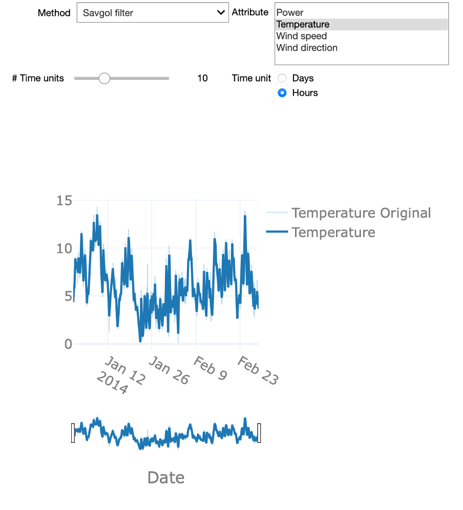
Now that we know the general idea of smoothing, We can experiment with these different approaches in the interactive starter kit. At the top of the graph, we can select one of the explained methods. Using the time unit controls, we can explore how the level of detail resulting from the smoothing varies for different window sizes. Can you strike a good balance between too much and too little detail? This is a difficult question to answer, as it strictly depends on the goal of the analysis.
Smoothing using a large time window, for example, several days, can be useful to detect slow, long-term changes to the time series. On the other hand, a shorter time window, let’s say 12 hours, can be very efficient to analyse short-lasting changes in the signal by getting rid of fast transients in the signal.
There are also some significant differences in the presented methods. If you chose the rolling median method and zoom in, you will be able to see that the signal appears 'shifted'. This is due to the fact that the rolling window implementation of the Python pandas library that was used, uses a look-ahead option, where the value at any given point in time is given by a time window ahead of it. Another interesting aspect is how the Gaussian method creates a signal that is characterized by smooth 'Gaussian-like' hills, a consequence of its Gaussian kernel-based nature.
In sum, the Savgol and rolling window approaches create a signal that more closely follows the original signal. This is due to the fact that both operate using a local estimation approach: the latter method aggregates values over a local time window, while the former applies a least-squares regression over the specified time window.
We previously discussed the seasonal patterns that can be observed in certain variables such as temperature. One technique that allows analysing the seasonal patterns in a time-series signal and to decompose the signal into different components is called Seasonal Trend Decomposition. This technique identifies cyclical patterns in the signal and decompose it into 3 components: First, the trend, which summarizes the long-term trend of the time-series in the considered time frame. A second component is the seasonal component: this is the part of the signal that can be attributed to repeating patterns in the signal. Finally, the residuals are the "left-overs" after subtracting the trend and the seasonal factors from the original signal. This is the component of the time-series that cannot be attributed to either the long-term trend evolution of the signal or the seasonal patterns.
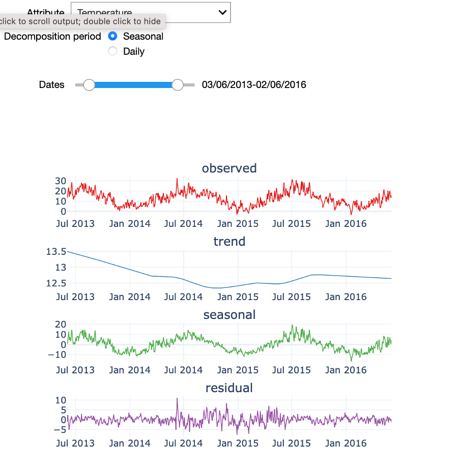
In the starter kit, we can analyse the seasonal trend decomposition over two periods: a seasonal period that covers the four yearly seasons and a daily period. If we select a seasonal decomposition over a sufficiently large period, we can clearly observe the yearly temperature pattern, with higher temperatures in the summer months and lower ones in the winter months. If you test a daily decomposition over the same period of time you will need to zoom-in on a short-time range and similarly see a pattern in the seasonal component, namely the 24-hour temperature cycle. You can also test how the seasonal trend decomposition performs on a less cyclical signal, such as power production. Indeed, since power production is mainly driven by the amount of wind and wind speed, each showing a weak seasonal modulation, power production can only be poorly expressed in terms of its seasonal component.
In the next video, we will discuss how outliers can be detected in seasonal data with stochastic fluctuations.
Authors: EluciDATA Lab
Permanent URL